Geometric Typefaces
Geometric sans serifs are exactly what their name suggests. Instead of being derived from early Grotesques, like a Neo-Grotesque, or from calligraphic and engraved forms like the Humanist sans, they are built on geometric shapes. The characters often have optically circular bowls and are otherwise typically very rectangular, sharing many components between the various glyphs.
Jakob Erbar, whose eponymous typeface is credited as being the first Geometric
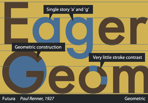
sans, reportedly based his construction on the circle. Released in the 1920s, Erbar-Grotesk was intended to be legible. Ironically, because of the awkward visual rhythm, resulting from strict adherence to geometric forms, Geometric lineals are among the least legible of sans serifs and are usually suitable only for display type. Geometric sans serifs usually show little or no stroke contrast and usually feature a single-story lowercase “a.”
Paul Renner’s Futura, Koch’s Kabel and Lubalin’s Avant Garde are typical examples of the style. H&FJ’s Gotham is also a Geometric sans, although it is less strictly geometric than some and allows for more variation in the heavier weights.
Source
Alessio, Joseph. "Making Sense Of Type Classification (Part 2)." Smashing Magazine. N.p., 19 June 2013. Web. 27 Apr. 2014.