Humanist Typefaces
If you remember the most important quality of Humanist serif type, you’ll be relieved to learn that the same quality carries over to the sans serifs! The primary characteristic of Humanist type, both serif and sans serif, is a strong calligraphic influence, basing its shapes and flow on forms that could originate from a pen or brush. This means a much higher stroke contrast, and some Humanist sans even feature some stress, whereas nearly all other sans serifs have a completely vertical axis.
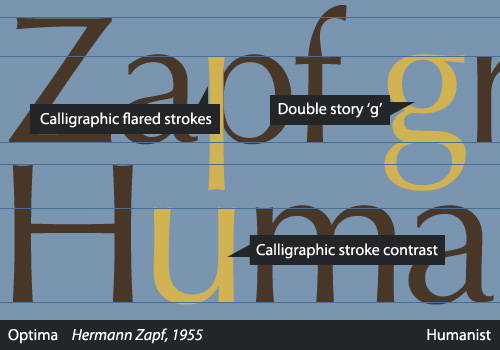
Another interesting characteristic of Humanist sans serifs is that their proportions often derive largely from Roman inscriptions and early serif typefaces, rather than 19th-century sans serifs as the Neo-Grotesques did. Because of this design process involving older letterforms, the lowercase “a” and “g” are most often two-story in Humanist sans serifs. All of these characteristics combine to make most Humanists a more legible choice than other types of sans faces.
Hermann Zapf’s Optima is one example that clearly shows the calligraphic heritage, with an unusually obvious difference between thick and thin strokes, while many others in this category have more subtle features. The Humanist sans group includes classics such as Gill Sans and Frutiger as well as more recent releases like Myriad (1991), Trebuchet (1996) and Calibri (2005).
Source
Alessio, Joseph. "Making Sense Of Type Classification (Part 2)." Smashing Magazine. N.p., 19 June 2013. Web. 27 Apr. 2014.