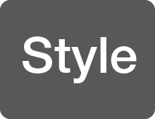
In most fonts, this weight of the typeface has the largest stroke weight and looks the darkest.
Bold
The most common way to add emphasis through weight. The stroke of this font tends to be far thicker than the roman/regular version of the typeface. The font appears darker than the roman/regular version of the typeface.
Compressed
The font is more tightly squeezed together than condensed versions. This leads to to far larger x-heights in comparison to width of a letter.
Condensed
Narrower fonts are usually labeled compressed, condensed or narrow. A condensed font can be further classified with extra, ultra, or super. Theses fonts have taller x-heights in proportion to the width of the letter.
Demi
This weight for a typeface falls in between medium and bold.
Extended
May also be called wide or expanded. This width of font features letters that appear to be stretched in the width direction instead of the height like Compressed and Condensed fonts. Like Condensed and compressed, the font may be additionally classified as extra, ultra, or super. They feature x-heights that are closer in size to the width of the letter.
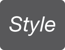
Italics/Obliques
Both italics and obliques are slanted designs. They both serve the same function in text, namely emphasis. Italics are primarily found in serif designs, and obliques originally were mostly associated with sans serifs.
Light
This weight for a typeface is darker than thin but not as dark as roman/regular.
Medium
This weight is darker than a roman/regular typeface, but not as dark as demi fonts.
Narrow
Similar to a condensed font. It features a taller x-height in proportion to the width of the font.
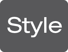
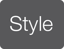
Regular/Roman
This is the standard weight and style for a typeface. It is the weight and width by which other weights and widths for a font are based.
Thin
This refers to the weight of the font. In most typefaces, this is the lightest font version available. It will often have hairline like strokes.