Transitional Typefaces
Work was begun on the first Transitional typeface in 1692, long before people had left behind making Garaldes. In fact, William Caslon was creating typefaces based on Old-Style Dutch type as late as the 1720s. Because this part of type history is also significant, many have asserted that “Transitional” is an inadequate name for it, and this category may also be termed Neoclassical or Realist.
In the late-17th century, Louis XIV, as part of a general renovation of France’s Imprimerie Royale (the governmental printing works), commissioned the French Academy of Sciences to create a new typeface. The Romain du Roi — literally the “King’s Roman” — was designed using a strict grid, and its development was an arduous process, involving a committee that included a mathematician and an engineer. Although commissioned in 1692, the entire family of 86 fonts was not completed until 1745.
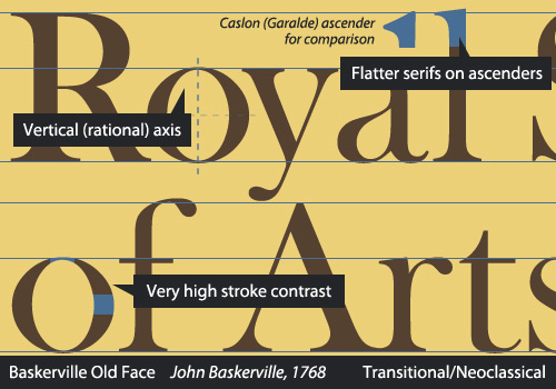
Two of the biggest names in type during this period were John Baskerville and Pierre Simon Fournier. Baskerville, an entrepreneur who dabbled in multiple businesses, developed quite an interest in printing and eventually designed his own type in order to improve on Caslon’s work. This did not please most of the printing world at the time, and Baskerville endured harsh criticism, despite having such luminaries as Benjamin Franklin as friends and advocates of his work. You may have read of the humorous encounter in which Franklin outwitted a critic of Baskerville. Numerous revivals, both metal and digital type, that draw on Baskerville have been made.
Fournier was among the printers who praised Baskerville’s type, reserving particularly high compliments for his italics. Fournier was highly respected in his lifetime, and despite having consulted royalty both within France and internationally on type design and having established printing houses, Fournier is primarily remembered today for introducing the point system as a way to measure type sizes. Pierre Fournier, uncannily sharing a name with an acclaimed 20th-century cellist, also had an interest in music and developed a new style of typography for musical notation.
In the Transitionals (or Neoclassicals), we see certain trends continuing. The axis is now nearly, if not completely, vertical. The weight difference between the thickest and thinnest points is now exaggerated. The serifs are less bracketed and flatten out. Details become very refined.
Eric Gill’s Joanna, Melior, Clearface and Mrs. Eaves — a Baskerville revival named after Sarah Eaves, Baskerville’s wife — all fall into this category.
Source
Alessio, Joseph. "Making Sense Of Type Classification (Part 1)." Smashing Magazine. N.p., 17 Apr. 2013. Web. 27 Apr. 2014.
